🗝️Key Finding #1: Unclear Representation
The NA represents two attorney groups, The Top 100 and The Top 40 Under 40, but the distinction and importance between the two aren’t strong enough.
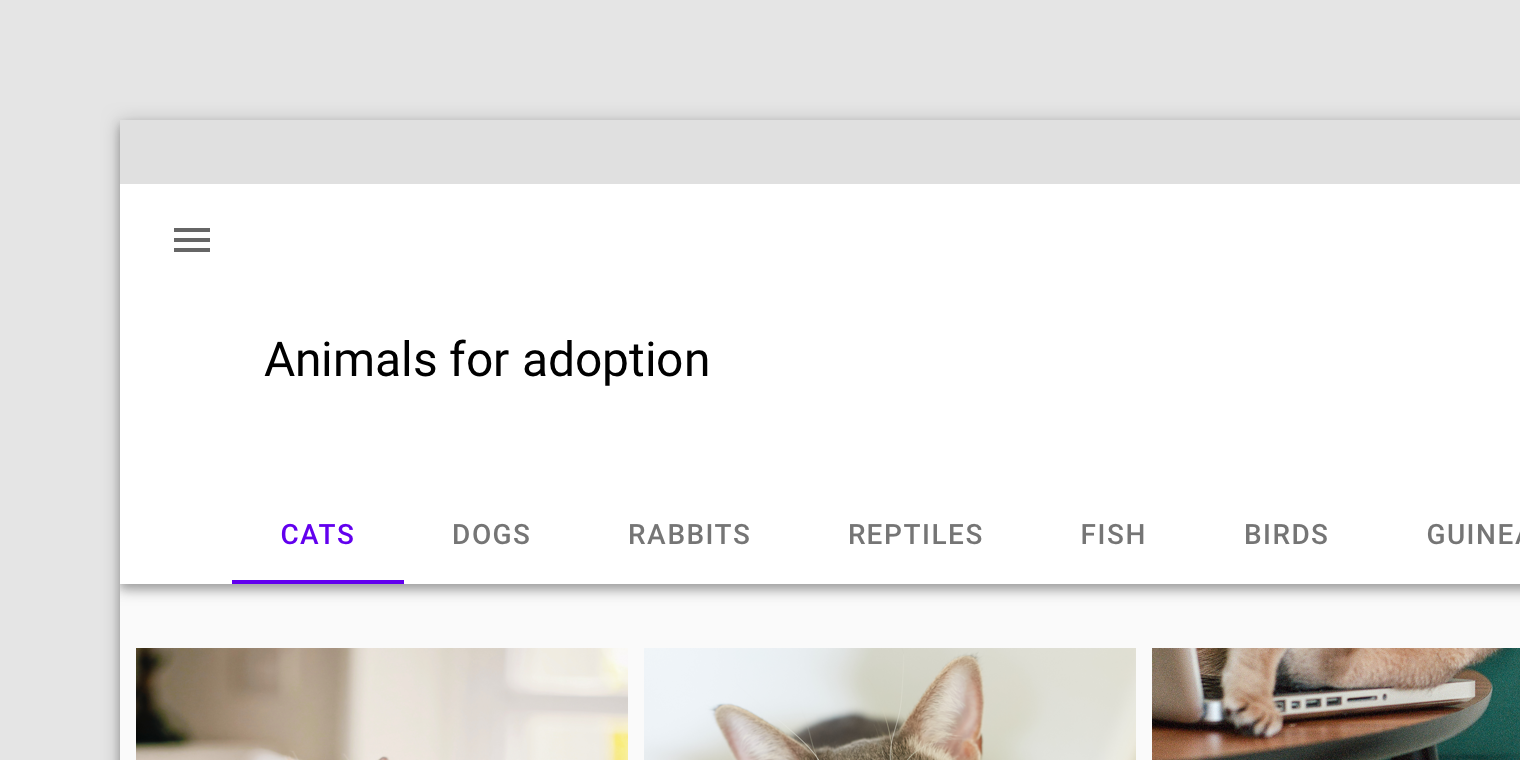
MEMBER-DRIVEN ORGANIZATION WEBSITE DESIGN
LAM provides marketing solutions for the growth, management, and service of legal associations nationwide.
To make legal products and services more useful, usable, understandable and engaging for all.
WEBSITE REDESIGN
Locating and connecting with the right attorney who can efficiently help with your particular legal issue may not be easy. Many search via word of mouth or use an online legal service.
The National Advocates (The NA) is an attorney membership organization that also offers a way for people to connect with local attorneys based on their location and type of legal case.
My first task at LAM is to redesign The NA’s website. I see this as an opportunity to go beyond a simple reskin and to take a heuristic approach that will focus on the needs of members and searchers.
Luckily, I have the blessing and enthusiasm from the Marketing Director and the COO. We all agree it will be beneficial to apply a user-centered design approach and to push our capabilities.
Using user research, design intuition, and UX best practices, I designed a website that:
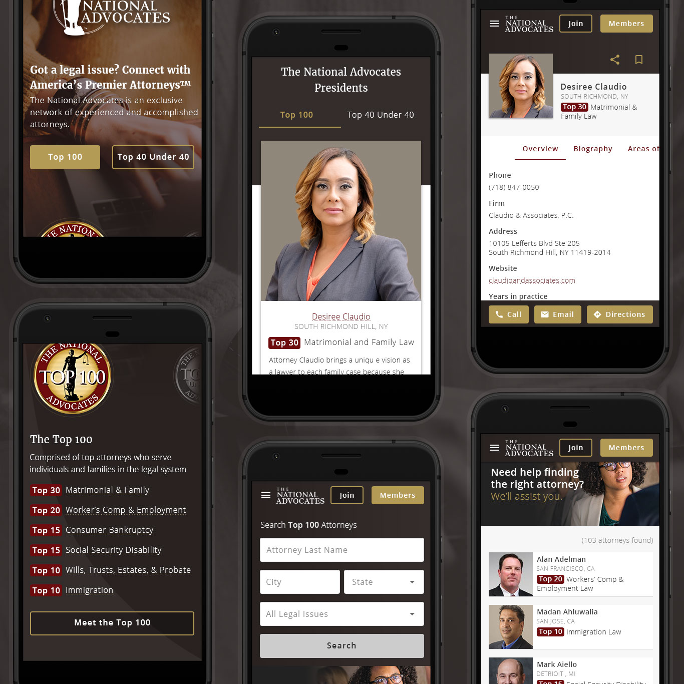
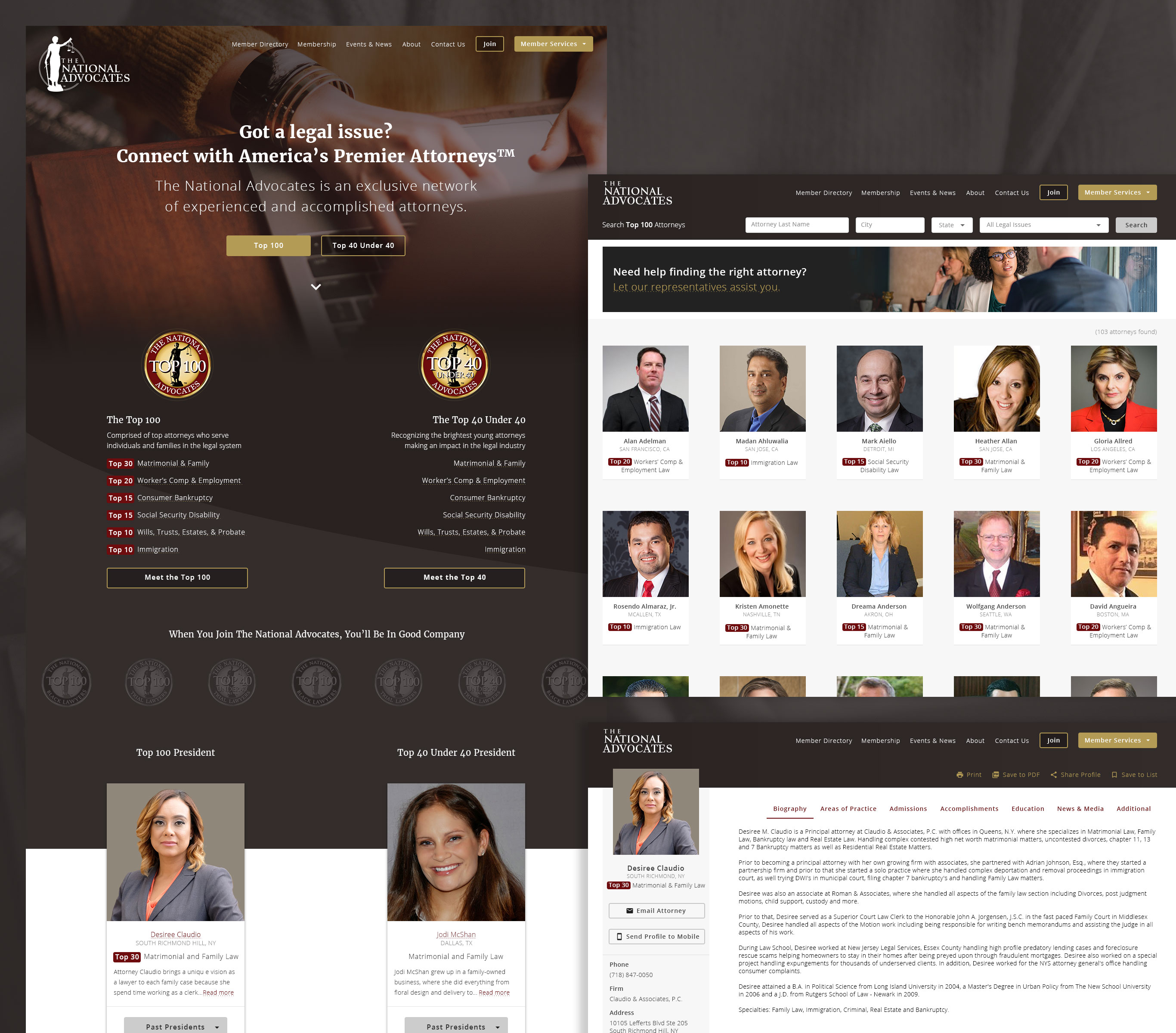
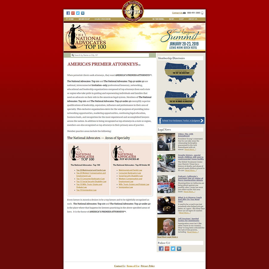 Current site
📌 Chelsea Note!
This case study details my process and also how I incited the importance of using design research in finding the user’s needs.
LAM is new to user-focused methods, so it was important that I provided the Five Ws along the way.
THE PROCESS
I went through a discovery phase to gather data and to present my findings and recommendations.
Before our kickoff meeting, I familiarize myself with the website, jot down my thoughts, and prepare questions for the meeting. I also prepare to explain my process to the team.
In order to get a better understanding of the situation, I interview 4 Stakeholders, 2 Coworkers, and received insights from The NA’s Top 40 President.
Sample questions:
The NA represents two attorney groups, The Top 100 and The Top 40 Under 40, but the distinction and importance between the two aren’t strong enough.
The NA suffers from a few of the major flaws of legal websites: lack of plain language, word walls, and lack of guidance through the information.
Due to fast growth, LAM uses one website template (layout and functionality) for all of their web properties (with slight color variances).
The NA website is visually outdated and has an unbalanced focus between members of The NA and people searching for an attorney. And the search experience is disjointed and frustrating to users.
There isn’t an official attorney referral service, but people request referrals (weekly) via voicemails and through the wrong channels (case submission form for members). Preference is for them to contact the attorney directly.
📌 Chelsea Note!
A stakeholder mentions this finding for a different project, but it resurfaces during the 📑 stakeholder presentation.
People also request assistance with the directory and some employees struggle with helping:
“We don’t have competitors.” Oh ho ho ho, I bet you do... 🕵️
To kick off the site auditing process, I start with documenting the current sitemap. I want to learn what content is on the site and how it is structured.
Continuing in the discovery phase, I audit the website and identify what works, what doesn’t, and what might be missing. Luckily I have 🍃 👀 to review the site with me: interns!
First, I compare the current state of the website to an established set of web usability guidelines developed by Dr. David Travis (UX consultant at User Focus). But then I discovered a nifty Usability Checklist (Airtable) template from Christopher Peterson (Experience Crafter & Story Teller).
The template features a usability checklist that includes the criteria and guidelines for grading the usability of the product/website.
The site appears dated, busy, and packed with a lot of information. There isn’t a clear starting place.
Recommendation: Maybe create a stronger tagline that clearly says what you do and why users should care. And also display a clear call-to-action (CTA).
Search experience and functionality could be improved. First-time users might not have the patience to learn it’s quirks.
Recommendation: To decrease frustration we should explore ways to make it more useful for users and less of a stumbling block.
The website is not device agnostic.
Recommendation: The new site should have a responsive layout so that any user on any device will have the best experience possible.
Continuing in the discovery phase, I review websites that focus on attorney membership, searching for attorneys and general membership advertising. I want to find out how useful the search functionality is, how the site engages users and to also document successful attributes that could improve The NA’s interface design.
Best Lawyers balances attorneys and searchers elegantly. There are clear indicators of where you are, what’s here and where you can go. Lawyer profiles are easy to navigate and read. (I’m not too fond of the animation when you first click a tab - talk about a mini whiplash!).
Super Lawyers takes advantage of predictive search and Google; leaves no room for input error from users.Best Lawyers features one input field that catches all queries (even relational words). Very efficient!
Super Lawyers - Vetted attorneys can showcase their expertise by answering state-specific questions about legal issues. Amazing opportunity to increase visibility!
First, I identify only 2 users - members and searchers. But as I continue through each research method, it is clear to me that there are other types visiting the site:
I learn through 📑 stakeholder interviews (Finding #2), that people who are not invited know about the organization and want to join. They normally send emails requesting to be considered.
When I talk to a coworker about the invitation process, I learn that potential candidates receive an invite through snail mail or email. The invite directs them to the ‘join page’ (to enter the invite code).
After submitting the invite code, they instantly see a checkout form. 😱 Ouch, this can potentially be an abrupt experience. Especially if you didn't’ read the (long and wordy) invite letter.
The NA is a resource and method for researching attorneys. It enables law students, journalists, etc. to learn who’s who in American Law.
I decide to focus on our primary users (Members and Searchers) and tackle their problems first and then trickle down.
“How might we help searchers feel informed and confident enough to contact an attorney (without assistance)?”
“How might we create a sense of community and support for members and potential members within The National Advocates?”
📌 Chelsea Note!
This frame stems from finding out later about our ‘invite acceptance’ numbers. I’m not at liberty to share them, but the numbers are concerning.
Also, networking is one of our benefits, but the presence of a networking environment is dry. Since this project, an ‘attorney re-engagement campaign’ started.😎
I capture all ideas from the Discovery Phase into 3 buckets: Doable, Need to Discuss, and Going Beyond. Now that I have a focus, I narrow them down to a few key actions that have the most potential for positive impact.
This key action will fall into our Content Writer’s hands.
For the first step, I will write the initial copy that will guide users within the site and help them interact with it. Then, the Content Writer will comb through and strengthen key areas.
This key action will fall into our General Counsel’s hands.
Together we will check out different attorney profiles and then list out important categories for our users.
This key action will fall on me and the developers.
For the first step, I’ll research 📑 different types of search experiences and share my findings. Together we’ll figure out what is and isn’t possible.
I revisit the sitemap so that I can optimize the structure in a way that will help users find the information they need across the website. It is simple but it has unnecessary levels and a few areas that can be consolidated.
I break the navigation into 3 groups (Top, Main, and Footer) in an effort to order the nav choices in the most logical and task-oriented manner.
I relocate the Member Portal to the top of the hierarchy so members can immediately see where they need to go to update their account and profile information.
I also move the Shop and the ‘Submit Your Settlement, Verdict, or Judgement’ button to the member portal because it is only relevant to members.
I rename ‘Member Portal’ to ‘Member Services’. Portal sounds out-dated. Don’t @ me. 😄
(But honestly, I noticed membership organizations using this wording).
I also rename ‘Submit Your Settlement, Verdict, or Judgement’ to ‘Submit Cases’.
I decided to merge the two directories, practice areas, and the two officers/executives directories into one unified directory and place it on the main level. This will eliminate the multiple channels, help people understand their surroundings and find what they’re looking for.
If not displaying, view image instead.
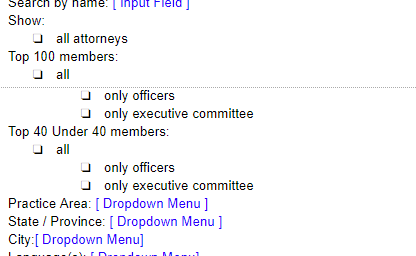
Pushing the new sitemap a bit further, I list out all of the different content types and functionality on each page. Using the Target Audience as a guide, I think about the goals for each page: “Why are users coming to this page and what do they care about?”
If not displaying, view image instead.
I create the first pass for placement, layout, and flow purposes. (I later work with the Content Writer to make sure the content is clear, concise, and useful.)
For member profiles, I create a list of categories with the General Counsel and we organize the groups.
To help kickoff ideas, I research possible features and functionality. I share my findings with the development team so we can brainstorm.
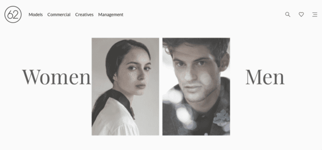
The split-screen layout is the logical and trendy way to give two contrasting elements equal consideration.
Tabs organize and allow navigation between groups of content that are related and at the same level of hierarchy.
Breadcrumb navigation element which indicates the current location in the archive.
I created a rough outline of the features in the filter.

The plugin provides relevant search results in milliseconds, ensuring that your users can find your best posts at the speed of thought.
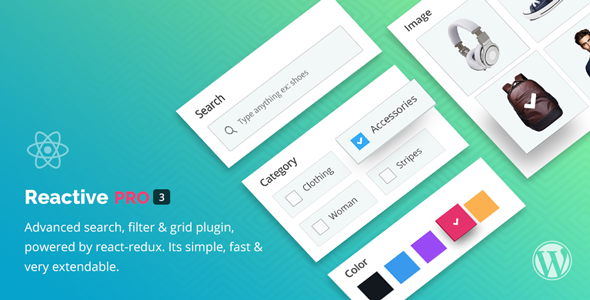
Advanced search, filter & grid plugin, powered by react-redux. Simple to install, very extendable WordPress Search plugin.
Using the 📑 content outline as a guide, I start the design process with sketches. This is the way I iterate through many design options quickly.
Here’s a glimpse of my thoughts when I create each of the iterations.
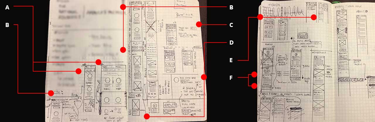
“What if the attorney groups stand equally side by side for desktop, and on hover of a group the other fades out causing the user’s eye to focus? They will stack in mobile though. Oopsie, I forgot the CTA.”
“Okay, the Search CTA can appear under the tagline and then we can display the attorney groups. How about addressing the top 3 actions that will benefit all user types up top? (Join, Login, and Search)?”
“To illustrate the wide network, what if we display all the group logos/badges in a slow-moving carousel?”
“What if we display the filters in a full-screen menu? Slide in from the right like Amazon’s filter menu?”
“How about using color labels to distinguish the attorney groups?
Maybe the label can display at the top right of the card. Eh, no. Oh! How about next to the Practice Name? Would work for portrait layout…”
“Should the selection of a filter auto apply? (Googles: “apply filters, UX”) No, let the user do it once they finish selecting items. It is frustrating (slow connections) to have the intention of selecting two or more filters, only to see the page reload painstakingly slow with each selection.”
”Maybe display the filter half-screen?”
”We have a lot of categories to display, let’s organize them in tabs.”
”To highlight the primary actions, let’s place them in a sticky footer.”
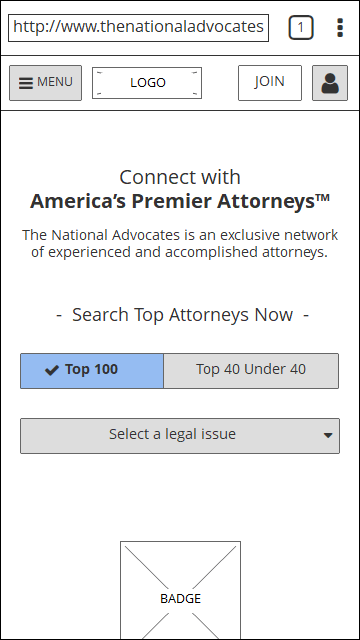
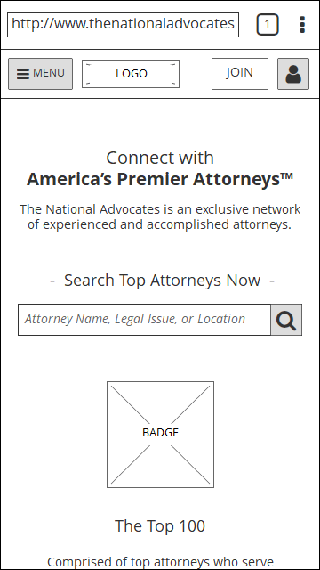
Happy with my beautiful sketches, I create wireframes in Balsamiq.
If not displaying, view images instead.
After showing the initial wires to the FED, they suggest I break the wireframes into ‘phases of development’. (Great idea, because it helped us get buy-in from the BED later.)
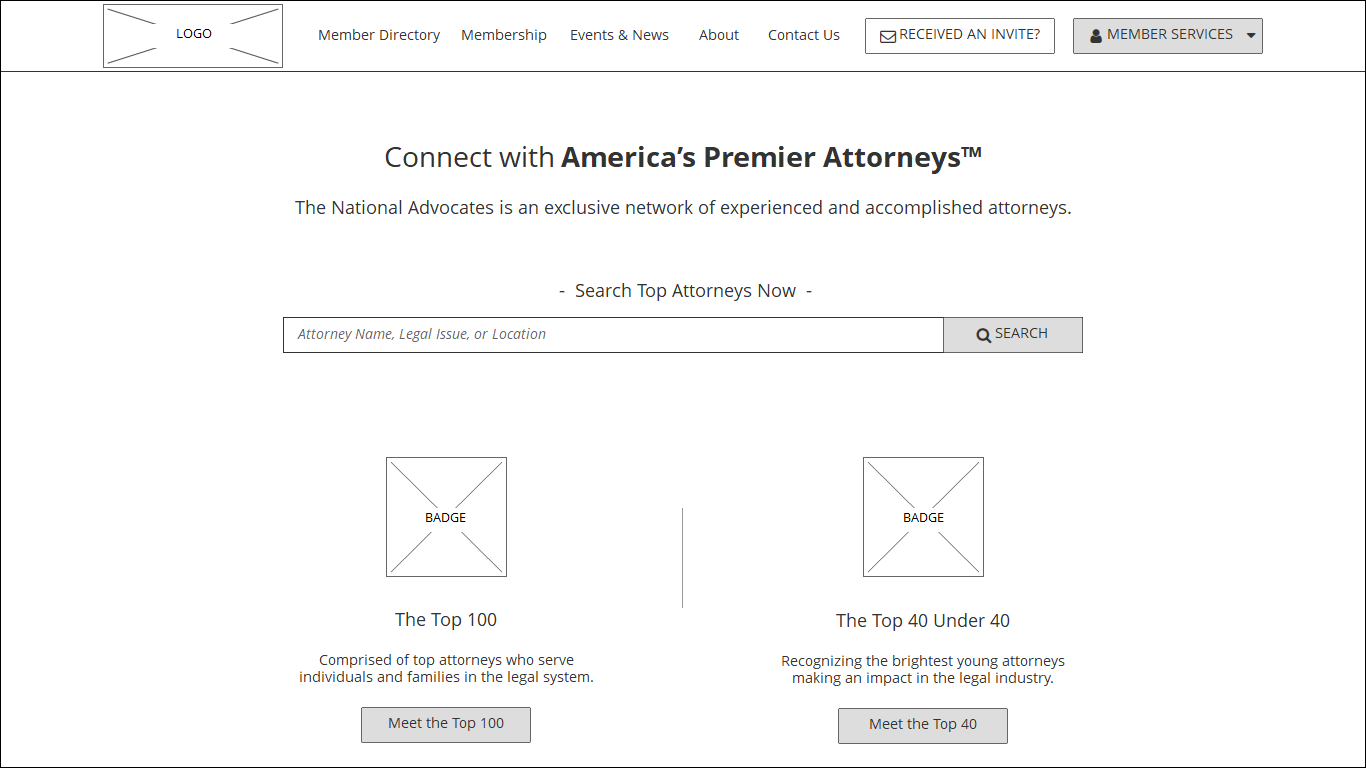
To illustrate interactions, I create prototypes in InVision:
Phases of development:
Once I update the wireframes with the developer’s feedback, I create a presentation for the stakeholders. It recaps the process (Slide #5), highlights prototype key features (Slide #15), and outlines the phases of development (Slide #25).
In an effort not to do what other sites are doing, the CEO thinks the first interaction should be with a map, not a search field.
A stakeholder would like to know how attorney referrals (Finding#4) will be handled in the site.
The CEO stressed that we must be “very, very clear about what practice areas we cover and who we are trying to promote.”
I initially removed the two ‘practice area’ list because it would display in the search field as the user types in a query. Since the CEO isn’t fond of the search field in general (and there’s a technical issue as well), I’ll find a way to bring it back.
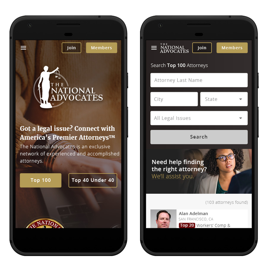
We will move forward with Phase 1 but will need to figure out how to handle the map interaction request from the CEO. The BED will also need to get up to speed on the new database and how to integrate it with WordPress. It will be a large undertaking for the team, so Phase 1 would be the best first step. While we work on that, I start the visual design process. 👩🏾🎨
With no brand guideline to pull from, I reference the attorney badge for colors:

I gather photos from Unsplash. I want to use photos that showcase working hands (typing, writing, etc.) and people with authentic, strong facial expressions.


I would like to have custom illustrations for each membership benefit. I gather examples for our Graphic Designer to reference. In the meantime, I’ll create rough placeholders.
To show the stakeholders the creative direction I’m going in. I share the initial visual designs in a presentation. It highlights the design goals (Slide #2), style inspiration (Slide #4), and prototypes (Slide #14).
Continuing to work, I warm-up the hero image and background color. Noticing the gradient is too sharp, I adjust the ‘color stops’ and smooth it out a bit more.
Mobile
Desktop
Prototype
The project is still a work in progress, but the new design has the potential to offer a unique lawyer directory that provides a comprehensive profile for each attorney with information that will help people select the right attorney.
As we get more information from the attorney re-engagement campaign, we can implement more wants and needs from our members. We have a new team in place that will connect directly with them and get all the lovely details.
I’m excited to see where this project will go once we have figured out technical issues and gathered more insights!

Is the office bird hitting on me? It sure likes to strike a pose whenever we lock eyes...🐤
If you’re interested in learning more, feel free to get in touch!